
How Wrong Was Spotify Wrapped? (Updated for 2025)
An excuse to play with ranking metrics, sparked by Spotify Wrapped messing with my top songs.
Background
Every December, Spotify Wrapped drops into our feeds like clockwork, offering a personalized summary of our listening habits. It’s fun, vibrant, and sometimes feels spot-on. But let’s be honest, almost every year there are some details that just feel off. I’m not talking about the fact that “Baby Shark” made its way to my top songs - this one I can explain. I’m talking about that one song which you do listen to, but you are quite sure not that much. Or a song you had on repeat and still didn’t manage to crack your top 10 somehow. Last year, several claims about the inaccuracy of Spotify Wrapped cropped up in the media. For me it was “Sunset” by the talented Caroline Polachek, which I just couldn’t get enough of, yet Spotify placed it at the modest no. 17. Meanwhile, one spot below came “Two Weeks” by Grizzly Bear. Now, don’t get me wrong, this is a great song which I did listen to - but not this much. Faced with the mystery of my missing favorites, I turned to a tool that has quietly, faithfully tracked my listening habits for years: Last.fm.
Last.fm
For those unfamiliar, Last.fm is a music tracking service that “scrobbles,” or records, every song you listen to across various platforms. It creates a detailed log of your music history, minute by minute, play by play. While it isn’t as flashy as Spotify Wrapped, it’s built around the idea of precision and transparency. If you listened to “Sunset” three times in a row at 2 a.m., Last.fm knows, and it is open to remind you when you wish it to. I have had it tracking my music for more than a decade, before I was even listening to any streaming service.
To perform the comparison, I needed Spotify’s version of my listening stats. Unfortunately, Spotify doesn’t provide users with a full, downloadable record of their annual listening history. However, they do generate a playlist called “Your Top Songs 2024,” which compiles what they claim are your most played songs of the year. I extracted the tracklist from this playlist and used it as the best available proxy for Spotify’s internal ranking.
With the two lists - Last.fm’s data and Spotify’s playlist - side by side, the discrepancies became immediately obvious.
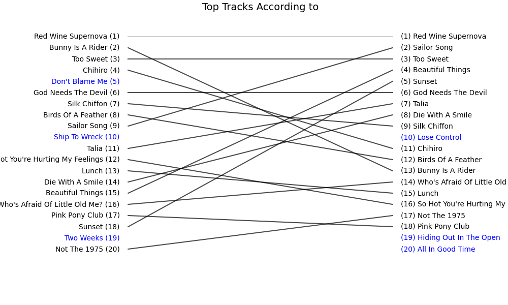
As you can see, my instincts were right regarding “Sunset.” In general, the two lists don’t look unrelated, but there are significant discrepancies. But how bad is it? How far are the two lists from each other? What does “far” even mean in this context?
How different are the lists?
Intuitive metric: Jaccard Similarity
First, do the lists even talk about the same songs? Jaccard Similarity looks only at membership, not order: overlap / union. When running this similarity test on my Spotify vs. Last.fm data, it gives 0.639, meaning roughly 64% of the unique tracks appear on both lists. Good news: the playlists are not strangers. Bad news: a third of the songs are unique to one source. Still, as intuitive and simple as this metric is, it is clear it misses a crucial point - order and ranking. Placing “Sunset” outside my top 10 of the year really feels off, and Jaccard doesn’t reflect such a miss.
The stats-head instinct: Spearman list correlation
This is the statistician’s immediate go-to tool for such analysis. Spearman list correlation asks: if I rank both lists, do the positions line up? If we number the songs somehow, will the resulting lists of numbers move up and down together, even if not at the same speed?
Here it landed at 0.726. That’s a fairly strong positive correlation: when Spotify ranks a song high, Last.fm usually ranks it high too, and low tends to go with low. It’s not perfect-there are still clear local mismatches like “Sunset”-but Spearman is already telling us that, on the whole, the two rankings move in the same direction.
The ML-flavored: Edit Distance
Anyone who has ever dealt with some sort of natural language processing task (NLP) knows this one. Our lists are not words, but we can pretend they are. If we treat each list as a sequence, edit distance counts how many insert/delete/move operations it takes to morph one into the other. The raw distance here is 88 (normalized 0.880 out of 1), which is high. Translation: if you start with Spotify’s list, you’d be editing a lot to make its order look like Last.fm’s, so the sequencing disagreements are substantial.
Rethinking: Bubble-Sort Distance (and Kendall Tau)
If we keep this line of “how hard would we have to work to make one list look like the other,” we could replace the insert/delete/move operations of the edit distance with one action: swap. Bubble-sort distance, based on the idea behind the famous sorting algorithm, measures how many adjacent swaps you’d need to align the two orders. For me this feels more appropriate for a comparison that deals mainly with ranking. Note that, as there are songs which appear on one list only, we can’t get them by merely swapping, so I added a step in which we concatenated the missing songs to the end of the lists. One might argue that this isn’t the perfect way of doing this, but it was the most straightforward for me.
After digging a bit online, I realized that this metric has another name: Kendall Tau Distance. Kendall Tau is Bubble-Sort Distance normalized. I then also realized that this distance has a “correlation cousin”: the Kendall Tau Correlation Coefficient, which can be calculated by using a different normalization factor.
Kendall Tau correlation here is 0.578 - moderately positive. The normalized bubble-sort distance lands at 0.211, meaning that about 21% of all possible adjacent swaps would be required to turn one list into the other. That’s not terrible, but it definitely reflects meaningful reordering.
Niche idea: RBO
While looking online about Kendall Tau, I found a paper that mentioned a slightly different metric I found interesting:
Rank-Biased Overlap (RBO).
This one is top-heavy by design: early positions count more,
and the influence decays with depth using a “decay factor” p.
Using the default p=0.9, we get 0.654.
That says the highest-ranked songs overlap more than the tail suggests.
The lists agree more on what’s “very top” than on the mid-to-low ranks.
Interesting.
Which metric makes more sense?
To be honest, I am not sure. Even though Jaccard ignores the order of the songs, it is important to note that all the ranking-aware metrics ignore all the songs in the world which were not listed on either list! Meaning that this view of the lists being moderately to strongly positively correlated (Kendall around 0.58 and Spearman around 0.73) is still restricted to the narrow world of the 100–200 songs that actually appear on the two lists. In a way, these rank correlations can be seen as complementary to Jaccard: they talk about agreement within that overlapping slice of my listening, not about the entire musical universe.
From those ranking-aware metrics I can’t really decide, as it feels that each tells me a slightly different story and highlights a slightly different aspect. My gut goes with Kendall Tau. But it might be a matter of taste.
Anyway, the results point to the fact that the top is quite similar - but just quite. As we keep going down the list, the discrepancies seem to get larger, or maybe just some songs “fall off”: out of one top 100 but not the other.
Putting all the scores in some context
Creating mock data
I found it hard to make sense of all those numbers. Is 0.52 high? Is it low? What about 0.88? In order to put those numbers in perspective, I created 3 mock lists to compare:
- Shuffled - my Spotify list randomly shuffled
- Swapped - my Spotify list where every two adjacent songs got swapped
- Fake - a dummy list with entries such as “Song 1” by “Artist 1”
First, let’s take a peek at those visually.
Table 1: Comparing Spotify vs Last.fm vs mock baselines.
| # | Spotify | Swapped | Shuffled | Fake |
|---|---|---|---|---|
| 0 | Red Wine Supernova | Bunny Is A Rider | labour | Track 1 |
| 1 | Bunny Is A Rider | Red Wine Supernova | Real Love Baby | Track 2 |
| 2 | Too Sweet | CHIHIRO | Ship To Wreck | Track 3 |
| 3 | CHIHIRO | Too Sweet | boys bugs and men | Track 4 |
| 4 | Don’t Blame Me | God Needs The Devil | Vampire Empire | Track 5 |
| 5 | God Needs The Devil | Don’t Blame Me | Now I’m In It - Bonus Track | Track 6 |
| 6 | Silk Chiffon | BIRDS OF A FEATHER | Oh Caroline | Track 7 |
| 7 | BIRDS OF A FEATHER | Silk Chiffon | Two Weeks | Track 8 |
| 8 | Sailor Song | Ship To Wreck | Blinding Lights | Track 9 |
| 9 | Ship To Wreck | Sailor Song | CHIHIRO | Track 10 |
It feels sensible to say that the “Fake” one is our “worst case.” The “Shuffled” one is really bad even though it contains all my top-100 songs, and the “Swapped” one is actually quite OK - even good.
Comparison Table
Armed with this, I ran the same comparisons as above and aggregated them all into one nice table:
| target | edit distance | edit distance (norm) | bubblesort distance | kendall tau | spearman | jaccard | rbo | composite score |
|---|---|---|---|---|---|---|---|---|
| Last.fm | 88 | 0.88 | 0.21 | 0.58 | 0.73 | 0.64 | 0.65 | 0.60 |
| Shuffled | 99 | 0.99 | 0.49 | 0.03 | 0.04 | 1.00 | 0.08 | 0.34 |
| Swapped | 51 | 0.51 | 0.01 | 0.98 | 1.00 | 1.00 | 0.84 | 0.90 |
| Fake | 100 | 1.00 | 0.50 | -0.01 | -0.50 | 0.00 | 0.00 | 0.00 |
I guess we can see that my Last.fm data sits somewhere between the “Swapped” (very similar) and “Shuffled” (very different) baselines. Note: the composite score I built isn’t meant to be a canonical metric, but it’s a sanity check that captures the general magnitude of difference across all methods. Here, Last.fm’s composite score (0.6) is well below the near-perfect “Swapped” scenario (0.9) and well above the “Shuffled” case (0.34). In other words: there is a substantial gap between Spotify’s list and Last.fm’s list. It’s not “total randomness,” but it’s also not “a few mistakes.”
Spotify raw data!
Realization that this exists and sending a request
At some point in this rabbit hole, I had a very simple thought:
“Wait… Spotify must have the real numbers. Can’t I just… ask for them?”
Turns out: yes, you actually can.
Hidden behind a few menus in your account settings is a privacy/data section where you can request a full export of your Spotify data. Among other things (login logs, account info, etc.), you can ask for your extended streaming history - basically a raw log of what you listened to, when, and for how long.
So I sent the request, forgot about it, and a few days later an email showed up with a link to a zip file.
Inside the archive were several JSON files with names like:
Streaming_History_Audio_2024_0.jsonStreaming_History_Audio_2024_1.json
At last, the source of truth: every play, every skip, every late-night loop of “Sunset” is in there.
To make this comparable to Wrapped, I did a few basic cleanup steps, aggregated play counts for each track, and filtered the top 100. From that, I built Spotify Raw Top 100.
Comparing top songs according to the raw data and the Wrapped list
Once I had the raw-based top-100 list, I put it side-by-side with the Wrapped playlist.
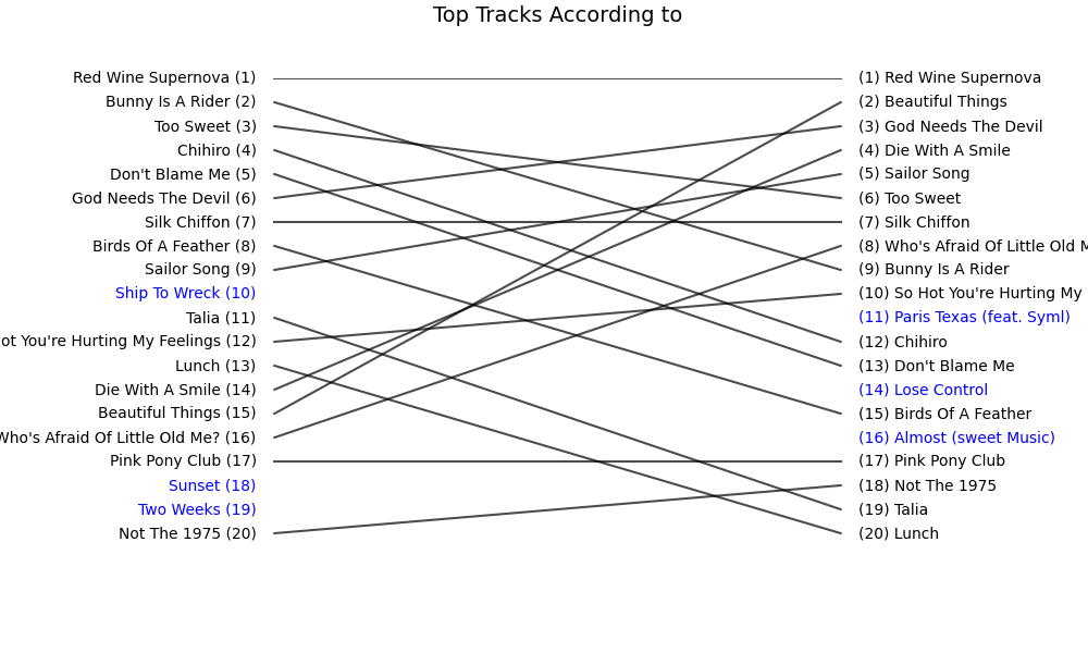
Long story short - they are not the same. Subjectively, the raw top 20 felt much more like “yes, this is my year in music.”
That’s the qualitative side. Now, let’s look at the numbers.
Computing the metrics for raw-vs-wrapped
I ran exactly the same battery of metrics as before. Here is the updated table:
Table 2: Adding Spotify raw logs into the comparison
| target | edit distance | edit distance (norm) | bubblesort distance | kendall tau | spearman | jaccard | rbo | composite score |
|---|---|---|---|---|---|---|---|---|
| Last.fm | 88 | 0.88 | 0.21 | 0.58 | 0.73 | 0.64 | 0.65 | 0.60 |
| Raw | 93 | 0.93 | 0.17 | 0.67 | 0.83 | 0.70 | 0.61 | 0.63 |
| Shuffled | 99 | 0.99 | 0.49 | 0.03 | 0.04 | 1.00 | 0.08 | 0.34 |
| Swapped | 51 | 0.51 | 0.01 | 0.98 | 1.00 | 1.00 | 0.84 | 0.90 |
| Fake | 100 | 1.00 | 0.50 | -0.01 | -0.50 | 0.00 | 0.00 | 0.00 |
So where does Raw vs Wrapped actually land?
In one sentence: Spotify Wrapped agrees with Spotify’s own raw listening logs to about the same degree that it agrees with Last.fm. The rank correlations are solidly positive (Spearman ≈ 0.83 vs. the raw data and ≈ 0.73 vs. Last.fm), but still far from a perfect match.
2025 Update: So… Did Spotify Wrapped Improve?
A year later, I ran the exact same experiment again - Spotify Wrapped 2025 vs. my Last.fm top songs - using the same ranking metrics as before. Let’s start with the visual comparison:
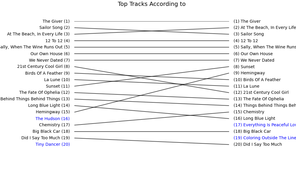
Looking better already!
Here are the new metrics:
| metric | value |
|---|---|
| edit distance | 86 |
| edit distance (normalized) | 0.860 |
| bubble-sort distance | 0.124 |
| Kendall Tau | 0.752 |
| Spearman correlation | 0.897 |
| Jaccard similarity | 0.802 |
| RBO | 0.902 |
| Composite score | 0.78 |
What changed?
A few things stand out immediately:
- Kendall Tau jumped from 0.578 → 0.752, suggesting the order of the songs aligns much more closely than it did in 2024.
- Spearman correlation is now 0.897, which is very high - once you focus on the songs that appear in both lists, their relative positions now move almost in lockstep between Spotify and Last.fm.
- Jaccard increased to 0.802, so the overlap between the two lists is significantly larger.
- RBO at 0.902 is particularly striking - the tops of the lists now agree far more than before.
Taken together, these metrics all point in the same direction: 2025 Wrapped is substantially closer to my Last.fm reality.
There is still a gap between the two data sources, but this time Spotify’s list feels much more like an honest reflection of my listening habits. This is real progress. Good for you, Spotify!
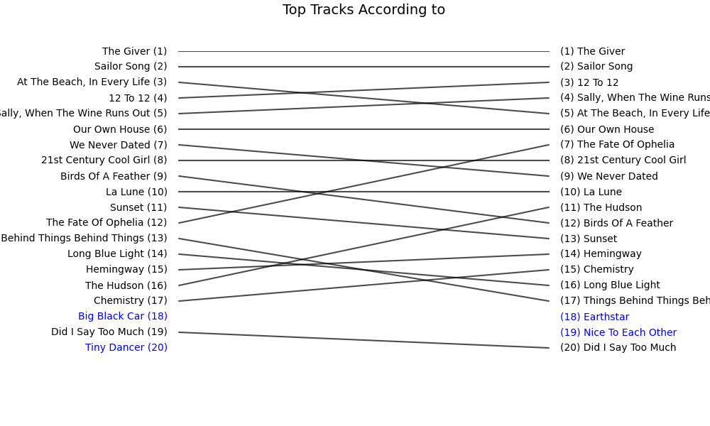
Update 2: Wrapped vs. Spotify raw logs
I also requested my extended streaming history for 2025, and reran the same “raw vs. Wrapped” comparison as in 2024.
Here are the results:
Here are the metrics:
| metric | value |
|---|---|
| edit distance | 88 |
| edit distance (normalized) | 0.880 |
| bubble-sort distance | 0.152 |
| Kendall Tau | 0.697 |
| Spearman correlation | 0.857 |
| Jaccard similarity | 0.770 |
| RBO | 0.889 |
| Composite score | 0.75 |
Somehow it is slightly worse than the comparison to Last.fm. Still, it is noticeably better than 2024 (which had composite score of 0.63),
I’m not gonna talk about the whole new “Musical Age” nonsense,
Conclusion? Is there any?
Maybe this whole rabbit hole was just my excuse to dive into ranked-list comparison. Either way, I enjoyed the ride. I’m still not sure what Spotify did or how their numbers ended up being such a mismatch. Is this intentional? Is there a reason or a deliberate bias? I don’t know, and I have no indication that this is the case. I just know that the folks there are sitting on a huge gold mine of cool data, and what they end up doing with it is this mess. It might not bother me as a user, but it offends me as a data scientist.