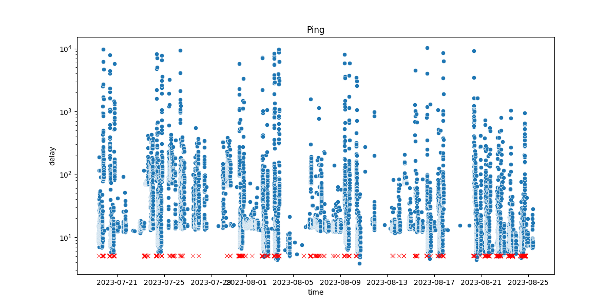
Ping Logger Project: Visualizing Network Connectivity
I wanted to share a cool side project I’ve been tinkering with lately - the Ping Logger. It all started when I began noticing some wonky connectivity issues at home. I wondered if my internet was playing tricks on me, so I decided to put together a little something to track it.
I’m sure many of us have experienced those moments of frustration when the internet decides to play hide and seek. I was no different. I often found myself questioning whether my connection was being finicky or if it was just in my head. That’s when the idea of the Ping Logger struck me - a simple tool that could keep an eye on my network’s ups and downs.
I’m also a frequent train commuter, shuttling back and forth to work. If you’ve ever tried working or browsing the web on a train, you’ll know the connectivity is like a rollercoaster. It got me thinking: could I capture these wild connectivity fluctuations in a visual way?
I created a simple script that periodically sends out ping requests to a server. The responses are logged with timestamps. This simple setup allowed me to collect data on how long it took for these pings to travel to and from the server and store the results in a csv file.
Now, numbers are all well and good, but turning them into something you can grasp is another ballgame. Here’s where Pandas, Plotly, and Dash come into play. Pandas helped me make sense of the raw data, while Plotly and Dash joined forces to create interactive, easy-on-the-eyes visualizations.

You can check out the interactive and updated version here. It’s far from being a masterpiece, but it does the job 😊. Also, I deployed it as a flask app (using Plotly’s dash module) which is a bit more styled and friendly and can be found here.